
Follow Emily Fertic on WordPress.com
Stay up to date on all of the book releases, books in progress, and behind the scenes information that will be shared here.
Cover Reveal!
- Cover Reveal!
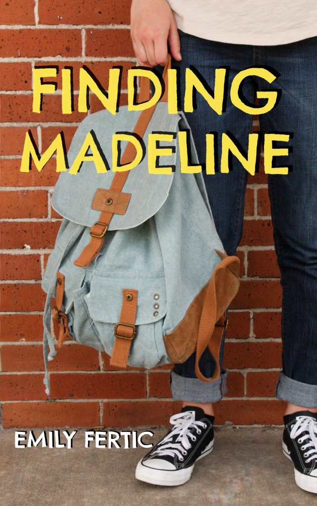
Here it is! The official cover of Finding Madeline. The stars aligned to make this cover happen, but I am so happy with how it turned out in the end.

I had a vision for this cover from the moment I started working on the book. I wanted a girl, standing on the sidewalk up against a red brick wall, and holding a backpack. That was it. It was simple, but I knew once I had that picture, I could add the title and it would be exactly what I wanted. I’m very lucky to have some incredible friends that were more than willing to help me bring that vision to life.
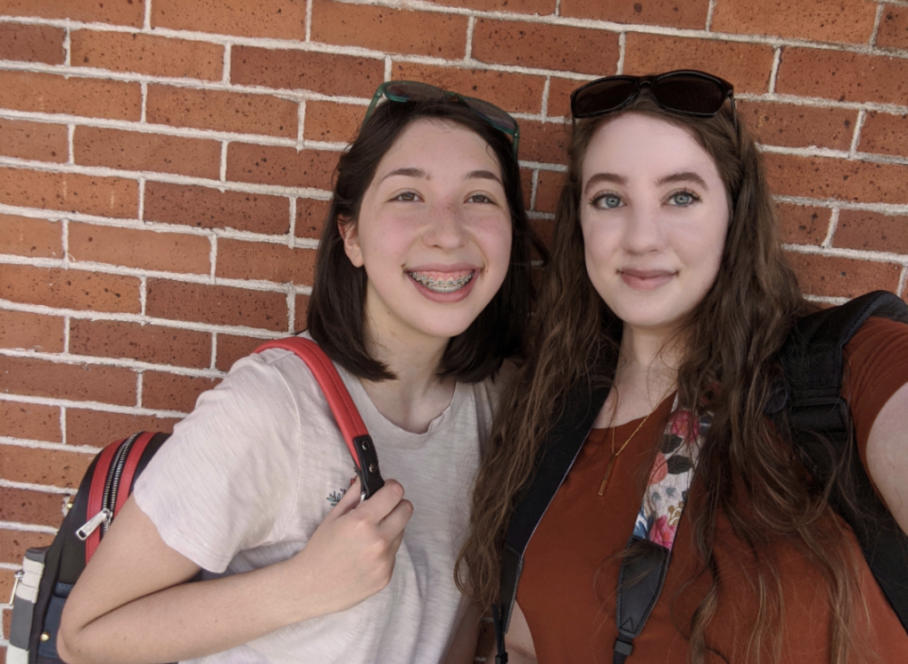
I grabbed my camera and met up with my friend, Gracie, to go to the historic downtown district of my city. I’ve been there countless times in my life and not only is it beautiful, but I knew there was tons of red brick that would be perfect for the background of the picture. My original plan was to take the picture outside of the old high school that now functions as a community center. Where better to take a picture for the cover of a novel that takes place in middle school than outside of a real school, right? When we got to the school and walked around to find the right spot, we realized there wasn’t going to be a place where Gracie could stand on the concrete and be up against the wall. We gave up on the high school and went looking around downtown.
We walked for a few blocks and there were plenty of brick walls, but none of them were quite right. They either had grass in front of them rather than sidewalk, or the bricks were too yellow or brown rather than red. It was about 95 degrees in the sun where we were and both Gracie and I started to get hot and discouraged that we weren’t going to find the right place after all. That’s when we spotted a dress shop across the street. The outside of the shop had a long stretch of a red brick wall with an awning-covered sidewalk right in front of it. It was perfect.
It took a few tries with different camera settings and poses, but in less than ten minutes, we got the perfect picture. When I say perfect, I mean perfect. As soon as Gracie and I saw the image preview on my camera, I gasped and she said, “That’s it.” The picture used for the cover has had almost no retouching. The only thing I fixed was a slight mark on the sidewalk and that was it. Everything else is exactly how the photo came off of my SD card. I took one more picture of just the wall to use for the back cover and that was that. We got back into the car, stopped for some coffee, and called it a day.
I had my cover images; I had my font picked out, and all I had to do was pick out the right font color. Going into the whole cover making process, I had no idea that finding the right font color would prove itself to be the hardest part.
Remember those incredible friends I mentioned before? Gracie wasn’t the only one of those. I am so blessed to have friends that are other authors and are happy to help me when I run into problems like this. Full transparency here, it actually took a couple of weeks to land on the right font color. I know that sounds crazy, especially knowing that the color I ended up going with is a pretty standard looking yellow, but hear me out.
Every color I tried either clashed with the red of the brick or blended in with the blue of the backpack or the dark denim of the jeans. I never even considered yellow because, fun fact, I hate yellow. There are some occasions where I like certain shades of yellow when paired with other colors, but for the most part, I just hate the color. When one of my author friends, Crystal Crawford, said that her husband recommended yellow, I was willing to try it because at that point I was ready to try anything but I didn’t have much hope considering my dislike of the color. As soon as I saw it I knew that was the right choice. This was one of those scenarios where, when paired with the other colors on the cover, I actually liked the yellow.
From there, they helped me a little bit more with the size of the title and the placement f my name and before I knew it, the cover was complete. Once the front cover was done, putting the full cover spread for the paperback version was a breeze.
I am so grateful for my friends and family that were there to help me at any place along the way. This cover wouldn’t have turned out as well as it did without them.
I am so excited to finally share the cover and the story of how it came to be with all of you. I’m even more excited for this book to release on August 11th and for you all to get to know Madeline and her story.
For more information about how the book came to be, check out my other post here. For sneak peeks and a countdown to the release of Finding Madeline, follow me on my social media.
Happy reading,
Emily Fertic
Introducing, Finding Madeline
July 7, 2020
I am happy to announce that Finding Madeline, my first independently written novel, will be released this summer! Before I go into detail about the fun stuff that will be leading up to the release, I need to tell you a little bit about how the book came to be.
If I’m being completely transparent, this is a book I never thought I would write. It’s a story I never thought I would tell publicly because I felt it wasn’t one worthy of being told. At least, that’s what I thought until my friend, and writing mentor, Crystal Crawford, told me otherwise.